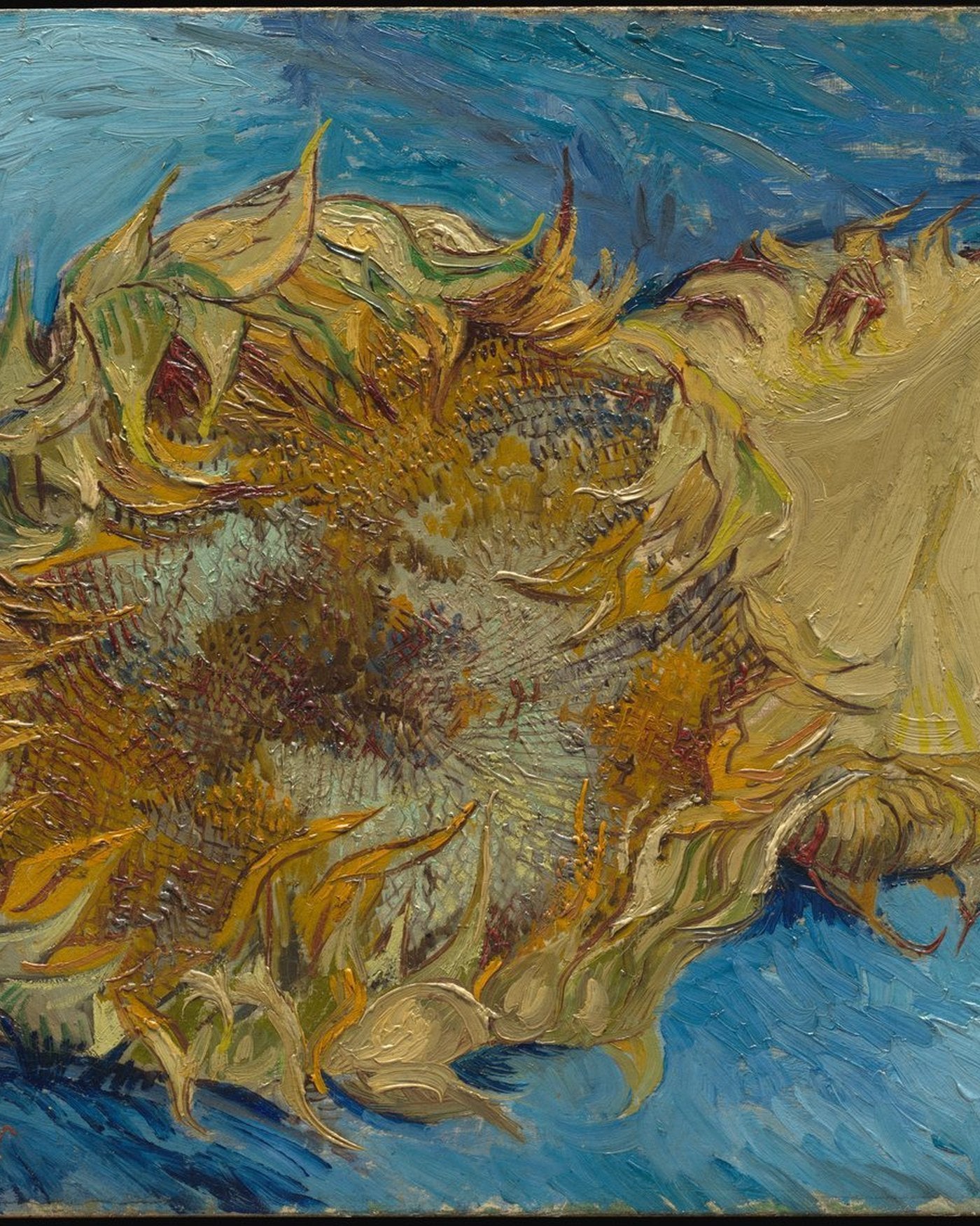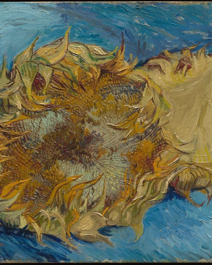


Navy Blue and Gold Sunburst
From $361.00


Click to view full size
Open edition · Made to order
This hand-painted blush and rust abstract oil painting brings a distinctive vertical composition to a contemporary interior. Its reference image combines a clearly defined visual idea with the individual marks and changes of density that make painted surfaces engaging to live with. The artwork is presented here as “Blush Fragments with Warm Rust,” with product reference OA 2085. Read the composition as a whole from across the room, then move closer to explore the smaller transitions. The selected size and finishing option determine the physical format of your order; room images illustrate possible settings and are intended to help with placement.
Large blush, ivory, rust and burgundy fragments overlap in a tall abstract arrangement. Pale blocks occupy much of the upper and right areas, while warmer red and orange passages gather through the middle and lower section. A raised white form near the center interrupts the surrounding planes, giving the composition a distinct point of texture and light.
The palette moves between soft pinks and much deeper wine-red and brown tones. Beige, muted grey-green and near-black accents prevent the arrangement from becoming uniformly warm. Some shapes have broad, relatively quiet interiors, while others show rough edges, scraped color and visible transitions. These differences create depth even though no literal object or setting is described.
The central white passage is especially tactile, with folds and ridges that catch light differently from the flatter neighboring fields. Its irregular outline contrasts with the larger rectangular and angled blocks around it. Smaller dark interruptions link the upper and lower sections, helping the eye move through the vertical composition rather than stopping at one isolated color.
The work feels assembled through layers and changes of direction. Some boundaries are sharply separated, while others blend into dragged paint or scattered traces. This mixture gives the abstract language a human, hand-worked character. The mood can feel warm and expressive without becoming crowded, making it adaptable to a room that already contains a restrained range of natural materials.
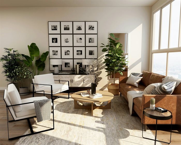
Ivory walls, pale oak and oatmeal linen give the blush and rust colors room to stand out. A muted pink cushion or a simple brown ceramic can connect the artwork to the setting without repeating every tone. The vertical format suits a console wall, bedroom or reading space where the central raised white passage can be seen at a comfortable viewing height.
The vertical orientation is an important part of how this composition works. It gives the subject its particular balance of occupied areas and breathing space, so maintaining that proportion matters when choosing a wall. The main color family includes pink, red, orange, white, beige, brown, black, grey; these tones can appear a little different under cool daylight, warm evening lamps or a bright screen. Consider the painting in relation to the wall and larger furniture rather than matching every small accessory. One repeated tone in a cushion, ceramic or textile is often enough to connect the artwork to the room while keeping its own character.
Before choosing a size, measure the available wall and the furniture beneath it. Marking the proposed outer dimensions with removable paper or tape can help you judge the scale from normal viewing positions, including a doorway or the opposite side of the room. Allow a comfortable margin around the artwork and avoid placing tall objects directly in front of the central subject. In a living room, relate the placement to the full sofa; in a bedroom, center it with the bed. For a console or desk wall, keep the frame visually connected to the furniture while leaving practical clearance for everyday use.
Select the size and presentation from the available product options. Rolled canvas, stretched canvas and framed selections describe different finishing choices, so review the option name carefully before ordering. The frame shown in an image is a visual reference; the finish supplied follows the option you select and the details agreed for your order. If you need help deciding between sizes or finishes, contact us before production so the intended placement can be considered. A simple frame can reinforce the composition, while its color should work with both the artwork and nearby materials.
Each piece is painted by hand, so small differences in brushwork, paint ridges and color transitions are part of the finished result. The reference establishes the composition and overall palette rather than promising a mechanically identical printed surface. The texture visible in a photograph also changes with the angle of the light. Soft daylight or a gentle side light usually reveals the relief clearly; harsh glare can hide detail. Avoid prolonged direct sun and damp conditions, and handle the finished surface carefully. For routine care, use a soft dry duster rather than liquid cleaners or abrasive cloths.
Before dispatch, we provide photographs or video of the completed painting for your approval. Please review the overall composition, colors and chosen finishing details at that stage. Small adjustments can be discussed before shipping, and the painting is not dispatched without your approval. This preview is particularly useful when you are coordinating the work with existing furniture or a specific wall color. If there is a detail you want to emphasize, tell us before production so it can be discussed clearly rather than inferred from an interior mockup.
Free worldwide shipping is included. Available sizes, finishes and current prices are shown in the product selector. Returns and exchanges may be requested within 30 days, subject to our refund policy and the conditions that apply to the order. Eligible customer-reason returns require the customer to cover return shipping; damaged work, quality issues or a result that does not match the approved painting are handled under the policy. Please read the policy before ordering, including the terms for custom work and cancellation once production has begun.
This is an open-edition canvas print produced to order, not an original painting.
Printed on 320 gsm heavyweight cotton canvas with archival pigment inks. The surface has a fine, natural weave and a matte finish.
Choose rolled canvas, stretched canvas, or a float frame in Gold, Silver, Black, White, or Wood. Each canvas is printed to order and dispatched within 3–5 business days.
Dust gently with a dry, soft cloth. Keep out of direct sunlight and away from damp walls.
Delivery usually takes another 2–6 business days after dispatch. Tracking is sent as soon as your painting leaves the studio.
If your painting arrives damaged, contact us within 30 days and we will make it right.
Read our Shipping Policy and Refund Policy.